Posts
Color Contrast in Canvas
Written by on
One of the most common accessibility errors on the internet today are color contrast issues. Canvas defaults to accessible color schemes, but often when adding content from external sources we can inadvertently add in colors that do not meet the WCAG contrast guidelines.
Consider the following example…
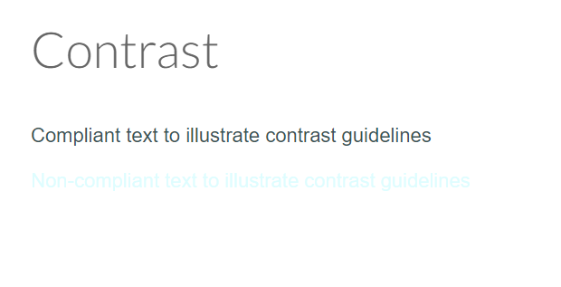
By using the correct contrast guidelines, we can assure that color blind individuals are able to understand that text is a hyperlink. Using proper color contrast also helps students who have perfect color vision, but may have sunglasses on or be working outside where the light pollution affects view of the screen.
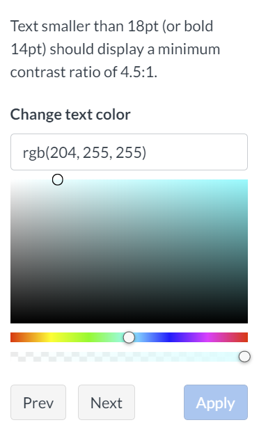
Canvas’ accessibility checker also looks for contrast errors on Canvas pages. The tool will catch contrast errors and help you select compliant alternatives. Please note that the “Apply” button to add the color will not allow you to click it until a compliant color has been selected.